This article covers adding elements to your graphic and customizing it to your liking.
With Tagboard's graphics engine, you unlock complete control to build a pre-designed, customizable framework that matches the look and feel of your production. Plus the ability to edit and produce with those graphics on the fly. Each Tagboard Graphic serves a template, so one graphic can actually be thousands of graphics as you edit the content, add data points through our app marketplace, and update the styling. If you're just getting started, review Creating a Graphic before diving in here.
The Graphics Builder
The Graphics Builder works in elements and layers on the lefthand side. As soon as you add an element, it becomes customizable on the righthand side.

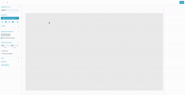
Template Title
First, in the top left corner, give your template a title. This is important so it's easy to identify which template you're selecting when adding the graphic to a production in Tagboard Producer.
Canvas Settings
After you title your template, work your way down the left side of the builder until you get to canvas settings. Before you start building it's important to have the canvas match the pixel width and height of the screen you're going to display your graphic on. The default is 1920X1080 (standard TV screen ratio).
- Safe Area
- You can check this box to display a safe area on your canvas. This will help visualize areas on the screen you want your graphic to avoid. You can adjust width and height by percentage between 0-100%.

- Rulers and Guides
- Checking this box will make rulers appear. If you click into the ruler area and drag out from there, then a guide will appear. After you've dropped the ruler, you can re-click it and drag to reposition.
- Once guides are set, you can uncheck the "Rulers and Guides" box to hide them. Checking again will have the rulers and guides reappear.
Adding Elements
Now that your template has a title and the canvas is set, let's start building. You will build your template by adding different elements. There are 5 basic elements [text, image, video, shape, and QR Code]. There are also several "Advanced Elements" options. As you click to add elements, you will see that they automatically appear in your canvas as well as create a new layer. You can simply drag and drop individual layers to reposition the order in which they appear.
Each layer will have its own robust list of customizations that appear on the right sidebar of the builder when the layer is selected.
- Text Element
- Image Element
- Video Element
- Shapes Element
- QR Code Element
- Size, Placement and Animation
Text Element
When you add the text element, it will populate a text box in your graphic builder that you will be able to move freely around the graphic as well as make a new menu appear on the right sidebar where you can adjust color, font style, font size, animations, and more.

Text and Text Box Resizing
When creating a text box in a graphic template, you will see the following options.
-
Autosize Text Box: The width and height of the text box would grow to fit the text within.
-
Fixed Size Text Box: The width and the height of the text box that is defined is fixed and would only change if done so manually in the canvas.
Under Text Layout, you will see the following options.
-
No-Wrap: You can set so the text does not wrap when it overflows.
-
Wrap Text: You can set so the text does wrap when it overflows.
-
Autosize Text: The text increases or decreases in size to fit the text box.
-
Max Text Size: This option is only available when the Autosize Text is selected. If you define a max text size, the text size will not exceed the specified size and only get smaller.
-
If a max text size is defined, then the text will behave the same as the current ‘shrink to fit’ as more text is added.
-
You can also define how you would want the text box to behave, or the text, or a combination of both.
For example, if you want a fixed text box where the text wraps when it overflows, then you would select the options Fixed Text Box and Wrap.

Or, if you want a fixed text box where the text scales to size, then you would select the options Fixed Text Box and Scale.

Style
-
Opacity: On a scale of 0-100% set the transparency of your text layer. 0% will be completely transparent, 100% will be completely solid.
-
Font: Start by selecting which font you want to use from the dropdown menu. At the bottom of the menu, you'll see a "Manage Fonts" button where you can add custom fonts. Any fonts you add will then appear in the dropdown menu. You can adjust the size, kerning (space between letters), and color of your font.
-
Text Styles: Options to make your font bold or italicized.
-
Text Options: Options to underline or strikethrough your text, or stylize your text with uppercase or lowercase only.
- Text Alignment: Align your text left, center, or right justified, and set the vertical position of text to top, center, or bottom.
-
Text Shadow
-
X: Adjust the shadow on the horizontal axis, left and right
-
Y: Adjust the shadow on the vertical axis, up and down
-
Blur: Adjust how harsh or feathered you want your shadow to be
-
Color: Set the color of your text shadow
-
- Background Color: By default your text background is transparent, but you can select this box to give your text a solid or gradient background. If gradient option is selected you can set the degree you want the gradient change to happen (180 is top to bottom, 90 is left to right).
Image Element
Once you click to add the image element, it will open your media library within your builder. From here, you can (1) select an image you've already uploaded to your media library, (2) upload a new one, or (3) search for a GIF. You would select the single image or GIF you'd like to create within this new layer and it would populate in your graphic template builder. Selecting the image in your builder will make a new menu appear on the right sidebar where you can adjust the position, size, and many other attributes.

Style
- Opacity: On a scale of 0-100% set the transparency of your image layer. 0% will be completely transparent, 100% will be completely solid.
- Fill Type: Three options to choose from... stretch, fit, and fill.
- Border: Checking this box adds a border around your image. You can adjust the width (pixels) of the border and color.
- Shadow: checking this box will give your image a drop shadow
- X: Adjust the shadow on the horizontal axis, left and right
- Y: Adjust the shadow on the vertical axis, up and down
- Blur: Adjust how harsh or feathered you want your shadow to be
- Spread: Adjust the width of your shadow
- Color: Set the color of your shadow
- Blur Image: If you don't want your image to be crystal clear you can increase the number to gradually increase the blur.
- Mask Image: add an oval or rectangle image mask. If you select rectangle, you also have the option to round individual corners.
Video Element
You can include video in your Graphic Template so you can add videos to playback b-roll, sponsor videos, animated backgrounds, and more! Clicking on the video element icon will create a new layer within your graphic template. Once you click to add the video element, it will open your media library within your builder. From here, you can use a file already uploaded or upload your own. Tagboard supports MP4 or WEBM file types. The file size limit is 100 MB.
You would select the single video file you'd like to display within this new layer, then choose "use file" in the top right of the media library. It will populate in your graphic template builder. Selecting the video in your builder will make a new menu appear on the right sidebar where you can adjust the position, size, and many other attributes.
Video Options

-
Autoplay: When checked the video will automatically play when the Graphic is taken live in Producer; when unchecked you will manually control play and pause
-
Loop: When checked the video will automatically play on loop if left Live in Producer; when unchecked the video will hold on the final frame
-
Start Muted: When checked audio will automatically be disabled when the Graphic is taken live in Producer; when unchecked audio will play in Producer
-
In/Out: Select the in and out points where you want the video to start and stop, in seconds (by default it will select the entire video length)
-
Play/Pause: Allows you to play and pause the video within the Graphics Template builder. You will see similar controls in Producer.
-
Unmute: Allows you to mute and unmute the video within the Graphics Template builder. You will see similar controls in Producer.
NOTE: The settings here will carry over to Producer, but you will also be able to update these settings on the fly in Tagboard Producer. So don't worry, what you enter here isn't set in stone.
Shapes Element
Once you click to add the shape element, a dropdown will appear below the icon with shape options. After selecting a shape it will populate in your canvas on the graphic template builder. Selecting the shape in your builder [or from the layer list] will make a new menu appear on the right sidebar where you can adjust the position, size, color fill, and many other attributes.
Style
- Transform: This allows you to skew the shape with a horizontal or vertical slant, and/or rotate your shape up to 360 degrees.
- Opacity: On a scale of 0-100% set the transparency of your text layer. 0% will be completely transparent, 100% will be completely solid.
- Rounded Corners: If you chose rectangle as your main shape, you can select to round individual corners.
- Background Color: Choose whether you want the background color to be solid or a gradient. If gradient option is selected you can set the degree you want the gradient change to happen (180 is top to bottom, 90 is left to right).
- Background Image: You can also select an image from your media library to add to your shape. Once the image is selected you can select whether you want the image to fill the entire space (and potentially crop parts of the image), or fit the image to the shape.
- Border: Checking this box drops a border around your shape. You can adjust the width (pixels) of the border and color.
- Shadow: checking this box will give your shape a drop shadow.
- X: Adjust the shadow on the horizontal axis, left and right.
- Y: Adjust the shadow on the vertical axis, up and down.
- Blur: Adjust how harsh or feathered you want your shadow to be.
- Spread: Adjust the width of your shadow
- Color: Set the color of your text shadow
- Blur image: If you don't want your shape to be crystal clear you can increase the number to gradually increase the blur.
QR Code Element
You can add a dynamic QR Code to any graphic and update the url for that QR code any time.
Create & Customize a QR Code
Once you click on the QR code element and add it to your canvas, you drag the corners to resize it. When you select it, a menu appears on the right sidebar.
Within this menu, the QR Code can be customized:
1. Change the QR Code URL so viewers get directed to a specific webpage/app when scanning.
2. Background AND/or dot color can be customized. Hex codes can be used when selecting the color picker.
3. Toggling "Logo image" on allows for a sponsor logo [or any image] to be placed in the center of the QR Code.
QR Code Scans
The QR Code URL will take viewers to a specified website or mobile app when scanned. This could be to a second-screen livestream experience, to vote in a poll on your website, or to a sponsored activation! See QR Code Analytics to learn about getting data on scans to share with sponsors.
Size & Placement
-
Position: Everything on your canvas works with a drag and drop workflow, or in the upper right corner you can set an exact X and Y axis.
-
Size: Click to select the element and drag the corners to adjust the size, or set exact width and height.
-
Snap To: Use this feature to snap your element to one of nine exact locations on the canvas (center, center-top, center-bottom, center-left, center-right, bottom-left, bottom-right, top-left, top-right)
- Nudge: Click to move the element one pixel at a time, to get exact placement.
You can hold shift + click on several layers to select multiple layers at once. If multiple layers are selected, you will see additional options in the right rail for size and placement:
-
Align: You need to have at least two layers selected to use align. Align all selected layers (Left, Center, Right, Top, Middle, Bottom).
-
Distribute: You need to have at least three layers selected to use distribute. This will allow you to make the horizontal or vertical spacing between selected layers even. Best practice of this is to first align the layers, and then distribute the spacing.
Animation
-
Animate In: Select from the dropdown menu how you want your text to animate onto the screen. The duration (set in milliseconds) determines how long your animation will last. The delay determines how long after selecting this graphic, the individual layer will begin to animate. Easing will allow you to change the acceleration of the animation, to be smoother or more natural. select from the dropdown to make a smoother and more realistic animation. The two most common easing options are "ease in", meaning the animation will start slowly and accelerate, and "ease out", where the motion will start quickly and decelerate.
-
Animate Out: Select from the dropdown menu how you want your text to animate off the screen, followed by same customizable options as above.
-
Looping Animation: If you check this box you can set a layer of the graphic to continue animating a certain way while the graphic is displayed on screen.
Working in Layers
Naming/Sorting
It is important to name your layers as you build your template, so they are easy to identify when building a graphic in Tagboard Producer. To name your layer, double click on the name. In addition to naming your layers, you can click and drag them to set the order from top to bottom.
Grouping
When you have multiple layers of your graphic that you want to operate as a single layer, you have the option to group them together. Group your layers by holding down the shift key, selecting the layers you want to group, and then hitting (Command or CTRL + G). You can then rename your group. To ungroup your layer you can use the hotkey (Command or CTRL + Shift + G) or click the three vertical dots and select the option to ungroup.
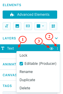
Lock
The lock icon (seen in the GIF above) is how you can lock or unlock a specific layer while building your template. Locked layers cannot be changed.
Editable/Rename/Duplicate/Delete
Clicking the three vertical dots right of the lock icon will open a modal with some additional options for each layer. Checking the editable box will make it so this layer of your template can be edited when customizing your graphic in Producer. Working your way down the modal you will see another way you can rename your layer, an option to duplicate your layer, and the ability to delete a layer.
Other Tools
Save
Your can toggle on auto-save in the upper right corner of the builder. Otherwise, be sure to press save periodically.
Hot Keys
In the upper left corner of your template builder you will see a keyboard icon that you can click to see different keyboard shortcuts that can be used to streamline your template building process.
Animation Preview
Once you have given layers of your graphic animations, this is where you can click to preview the animation.
There is also a box you can check if you have an animation you want to loop while the graphic is being displayed.
Tags
Be sure to add tags to your graphics so they're easier to track down when selecting a template in Tagboard Producer. Think of these as folders. Everything with the same tag will essentially be in the same folder.
Displaying Tagboard
For a quick overview, Tagboard is a web-based application that we recommend using via Chrome (for its security, speed, and ability to go fullscreen without controls or toolbars in view). There are several ways you can use Tagboard to visualize your story:
- Laptop-to-screen via appropriate cable connection (HDMI, DVI, or VGA),
- Signal conversion via scan converter, mixer, or scaler, or
- direct URL input to production software
With these methods in mind, visit the Producer Workspace to get started on displaying Tagboard. Consult Getting Started with Tagboard Producer to set up your production(s) and learn how-to navigate Producer... Tagboard's emmy award winning cloud-based production platform
Please utilize these resources, below, for a deeper dive into displaying Tagboard via Producer.